The function and purpose of a logo go beyond aesthetic. It represents your company, its business goals, and business personality.
A logo is one of the first things that potential customers usually see about your company, so your logo has got to have a great design. Before, companies had to hire professional designers to create a logo for them. These days, though, you can design your own logo that looks aesthetic, professional, tasteful, and meaningful.
Several web and mobile apps allow you to create and customize your business logo. You can create a logo from hundreds of templates or start one from scratch (which is always better). Whichever you choose, there are some simple rules that you should keep in mind to create a logo that best represents your brand, makes a solid impression on your potential customers, establishes your brand loyalty, and helps your business stand out from the competition.
Designing a logo can be a daunting task, whether it’s traditional or digital, but it is essential to your brand’s identity. A logo explains who you are, what and how you do, and what you can offer to your customers. Once you’ve designed the perfect logo, you’ll carry it anywhere – on presentation decks, social media, business cards, other marketing materials, and more. That’s a lot of work for a little graphic to do, right?
But don’t fret. This article gets you covered with logo design tips and tricks – some of which may be unusual to you. Whether you’re creating your first logo or you just need to update your existing logo to keep it fresh and exciting, follow these tips below to get you started and create a really good logo today.
1) Consider a visual “double meaning”
Some of the best logos out there utilize a technique where two pictures or images are combined into one through clever interpretation of a concept or idea.
Take the logo of the London Symphony Orchestra, for example. It combines the two images – the LSO and the conductor with a baton:
![]()
2) Color is vitally important
Don’t take the color palette lightly – it is one of the essential factors for logo design. It is far from a superficial decision because colors convey meanings and relay ideas.
Depending on the design of the logo or whether it requires one solid color or a rich color palette, the colors will grab your attention and pull you in. In addition, colors bring life to the illustration by highlighting the details and providing further context to the design. That being said, always keep in mind that a well-designed logo should have elements that are still recognizable in any color palette, even in grayscale or monochromatic scheme.
Here are the most used colors for a logo design:
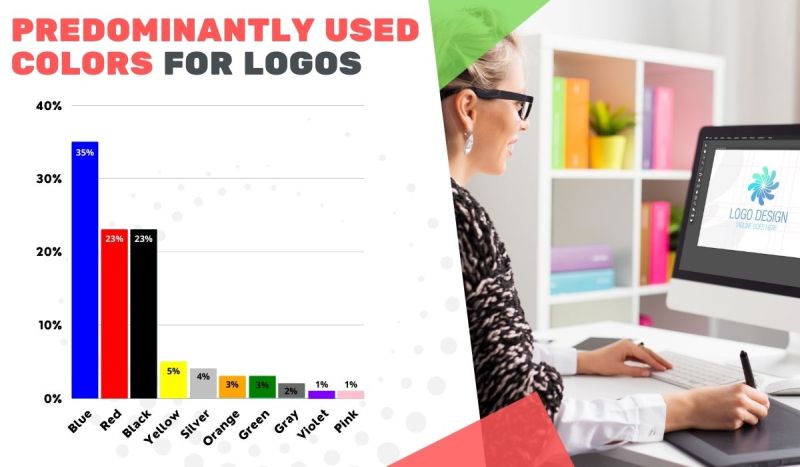
Data source: Designcrowd.com
Most companies like to keep everything simple with their colors, with a combined 76% of designs using a selection of one or two colors in their logos, which is regarded as the best logo-design practice. Designs that are heavy on shapes and textures than colors to convey their brand usually work better when being swiped up or down on mobile devices and in contexts where only black and white distribution is possible, like on some packaging.
![]()
Data source: Designcrowd.com
3) Avoid generic and overused logos
Every few years or so, some new trends come along in logo design. It’s okay to study any of the latest design trends and even jump onto a few bandwagons to keep up with the times. But in logo design? Don’t you hate it when other logo designers use the same idea over and over?
Studying the latest trends in logo designs allows you to be informed about what’s good and bad about them. But it doesn’t mean that you should follow them to the letter. So, avoid those clichés like those examples below:
The rainbow circle (or half-circle) formed by stylized humans (vectors):
Trees where trunks are humans or hands (actual logos):
![]()
![]()
Spheres (actual logos):
Roofs and cubic buildings (actual logos):


The logos are almost identical that you can’t tell the companies apart.
There are many more examples of generic and overused logos, but they should deserve a separate article.
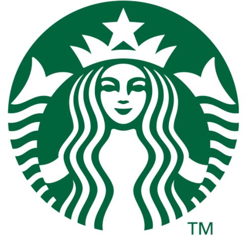
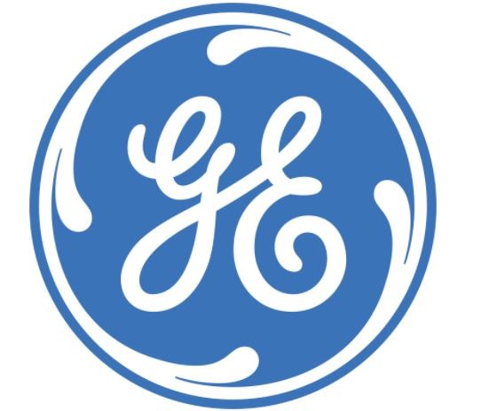
4) Make your logo ”ownable”
Instead of following the herd and using cliché designs like the ones you’ve seen above, you should instead look for something unique and recognizable.
Best examples of “ownable” logos:
Starbucks:
General Electric:
Amazon:

Unilever:
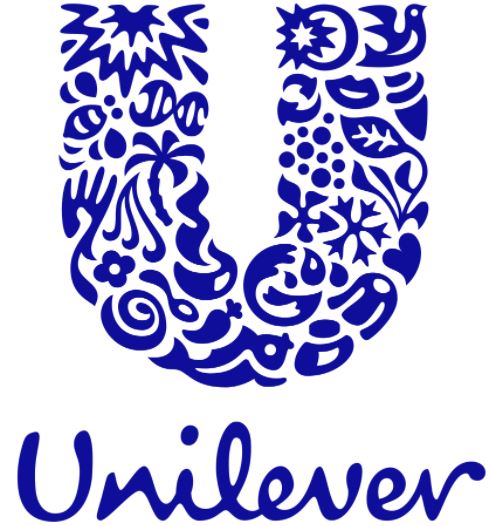
As you’re designing your logo, consider whether or not your design is generic or unique. Is it possible that others will come up with something similar? Remember, your first idea is usually your most generic, as it’s likely everyone else’s first idea, too. Try filling your notebook or pad with some rough sketches before choosing which ideas to follow after.
5) A custom-type lettering is highly recommended
While we’re still on the subject of being unique, there’s nothing that can give your logo a unique appearance like some excellent custom lettering.
Too often, many people consider logo design as simply a trip to the fonts menu to see which typeface the company name will look best.
However, custom-type lettering will help ensure that your logo will stay unique. Unscrupulous designers would rip off your work when they find out which typeface you used for your logo, but it takes genuine skill to imitate custom hand-drawn lettering!
![]()
The best example of this is the Coca-Cola logo, whose script has been stolen many times throughout the last decades. Like this one parody below:
6) KISS – Keep It Super Simple
“Simplicity is beauty” can also be true in logo design. Simple but powerful logos prove the best icons for standing the test of time.
The Apple logo (below) may be simple, but it is also one of the most recognizable logos today. But imagine it without its characteristic bite, the apple silhouette would be nothing special or memorable.
Apple:
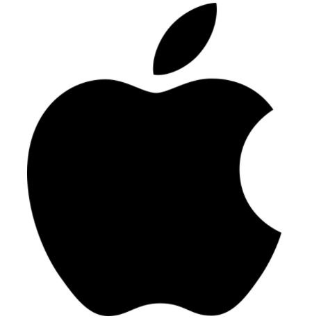
However, the bite gives the logo character, makes it unique, and gives it a deeper meaning (a computer byte – get it?). Without the bite, the apple logo is boring, and with it, the logo suddenly becomes iconic.
7) Don’t rule out proportion, balance, and symmetry
People recognize balanced and proportioned designs as pleasing to the eye. A proportioned design will strike a balance between the various elements that make up your logo.
Proportion is the weight of each element that makes up your logo. From a practical point of view, the right proportions will make your logo whole and help it make sense.
Symmetrical logos are balanced through equally weighted elements aligned on either side of a center line. But asymmetrical logos can be balanced, too, by using elements of different weights to create a composition that is uneven, but still has balance.
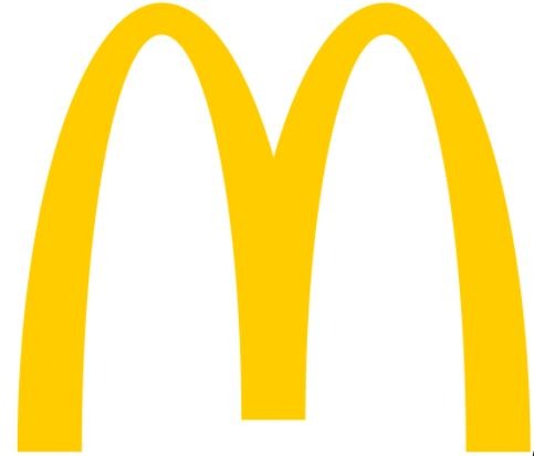
McDonald’s iconic logo isn’t just simply “M.” It was inspired by the “golden arches,” the architectural feature of McDonald’s earliest stores, as you can see it in the world’s oldest operating McDonald’s store in Downey, California:
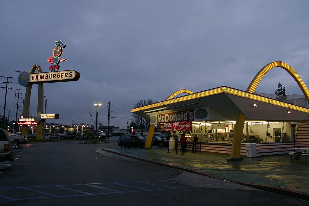
Even though the golden arches are not seen any longer in most McDonald’s stores today, they remain in the McDonald’s logo. The “golden arches” in the logo are evenly paired and stand out as a monogram to represent the “M” in McDonald’s.
We take the Apple logo, again:
It is also a perfect example of a symmetrical logo which gets thrown off balance with a bite, so that the apple won’t look like a cherry when it’s scaled down. The leaf on top of the apple gives a bit of asymmetry but also adds balance and liveliness to the design.
8) Consider negative space
Many of the best logos use negative space in a clever fashion. The industry standard example of this technique is the FedEx logo:
![]()
Do you see the arrow hidden in the negative space between “E” and “x”? FedEx’s use of the negative space is so subtle and that’s one of the best things about this logo. Many Americans have seen the FedEx logo regularly as it drives by on the side of the trucks. Yet they never even notice the arrow, which indicates moving forward and making deliveries.
9) Know what it means
Logos are beyond pretty visual representations of a brand. They had to have a story behind it. Strong logos are filled with meaning, both obvious and hidden. It has been discussed with a few cases above, like Apple and FedEx.
Clients may think that all they want is a logo that looks cool and exciting, but if you provide a logo that ties into your company’s history, mission, and core values, you’ll impress your potential customers, and they’ll love you for it.
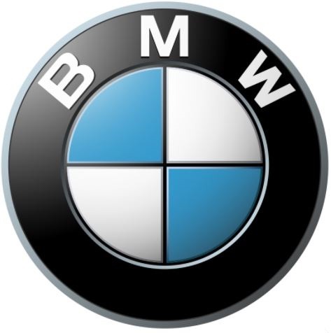
Take the case of BMW’s logo, which has a fascinating background. The German company first created aircraft engines before entering the automobile market. It’s for this reason why many people interpret BMW’s logo as representing a plane’s white propeller and a blue sky.
If you think your logos suck, consider these tips and tricks. No matter which image and brand archetype you want for your company, you have to have the right logo that will best represent them.